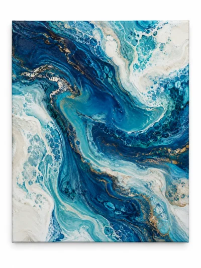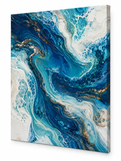
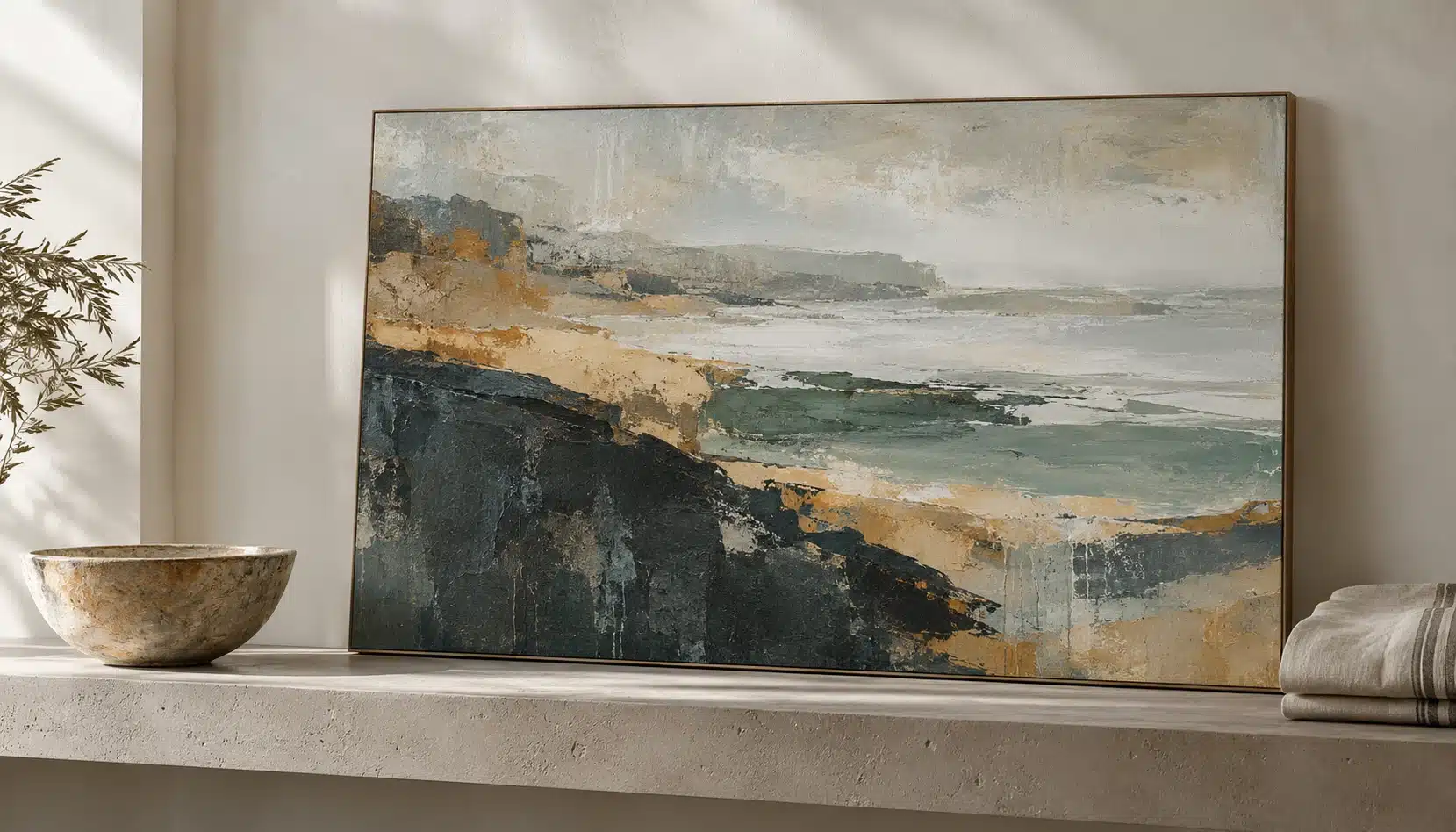
A coastal painting does not have to depend on bright blue water and white buildings. A shoreline can also suggest weathered ochre, grey rock, dry grasses, deep green, or the dark tones of volcanic ground. Looking beyond the most familiar colours opens more ways to bring a sense of the coast into a room.
Start with a particular visual memory
Think about a place or moment rather than an entire decorating style. You might remember pale morning haze, a narrow strip of bright water, or warm stone after sunset. The useful question is which relationships remain in your memory: a cool colour against a warm one, a broad pale field beside a dark edge, or one vivid accent in an otherwise muted scene.
You can use a few personal photographs as visual notes, while keeping the artwork’s own composition central. A painting need not reproduce the place exactly to evoke something you recognise. Abstract shapes and textures can suggest a landscape without illustrating every detail.
Pay attention to the darker tones
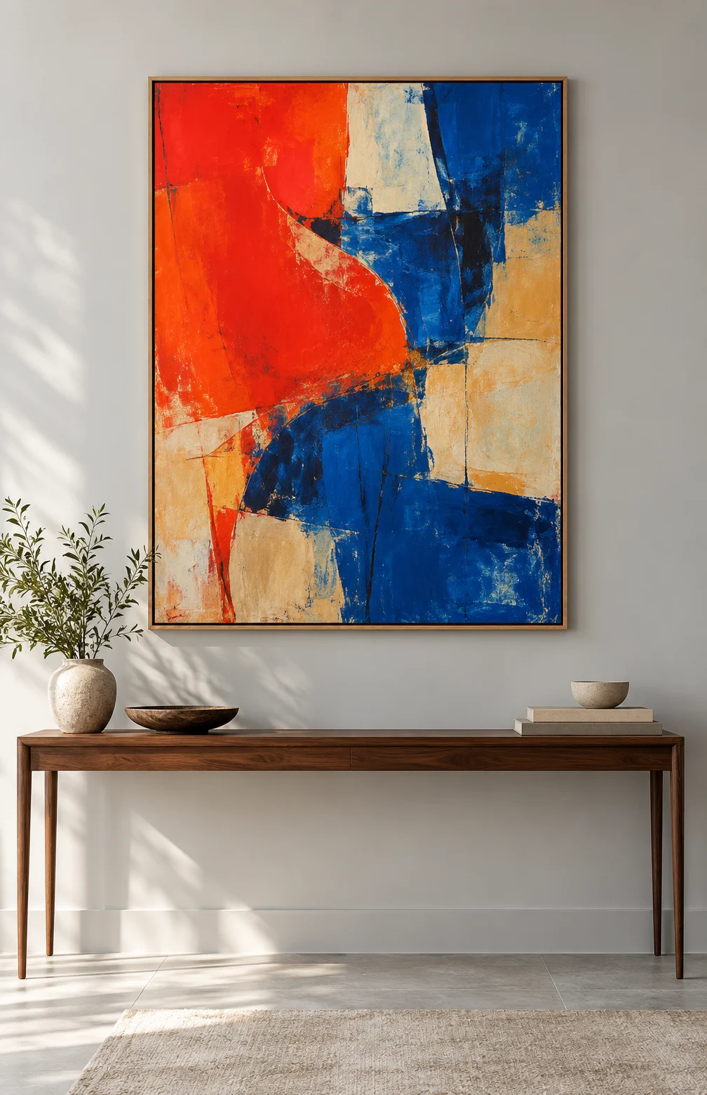
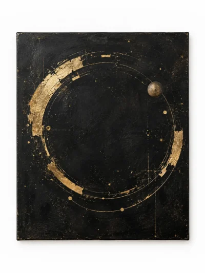
Light colours often define a coastal room, but darker passages can give them structure. A charcoal line may make a pale surface feel brighter. A deep green shape can connect a sea colour with timber or plants elsewhere in the space. Without some contrast, an arrangement may feel flatter than you intended.
Compare the balance within the painting before adding more colour around it. Does the work already have a strong dark anchor? Does it depend on small changes between similar pale tones? Let those features guide your response rather than using the same blue accent in every surrounding object.
Connect the painting to materials
Timber, woven textiles, ceramics, and stone can provide a quieter connection than a direct colour match. Look at their texture and tone beside the image. A rough surface may echo a broken painted mark; a smooth pale wall can give a busy composition useful breathing room.
Avoid turning every part of the room into a coastal symbol. A painting can carry the association on its own. Ordinary books, furniture, and personal objects help the space remain comfortable and individual, rather than resembling a themed display.
Check the palette in the actual room
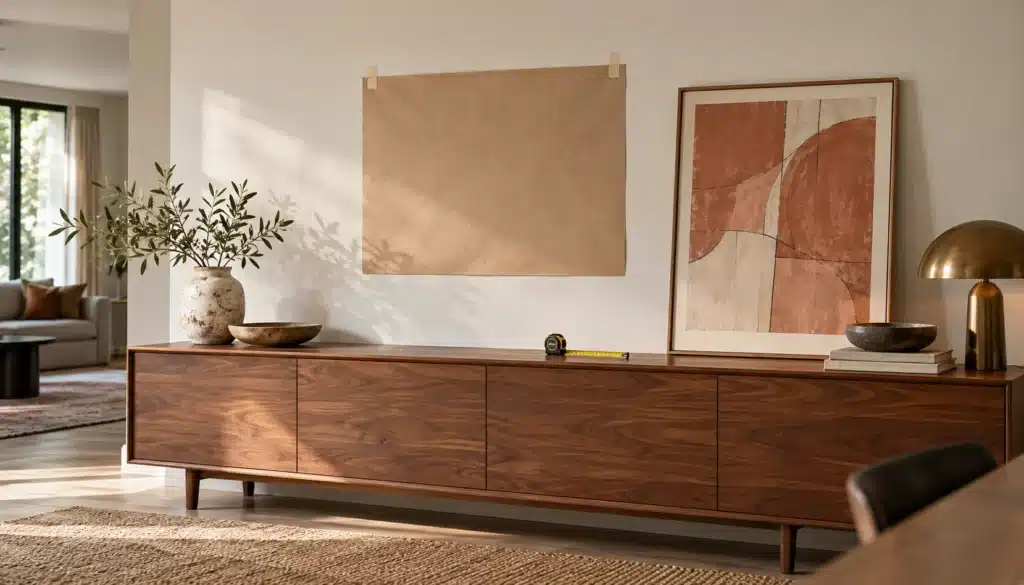
View the wall through the day and consider how its light affects your impression of the colours. A screen or small sample cannot guarantee that the real work will look identical at home. Ask for current photographs and confirmed materials when a physical painting is offered, and discuss any display requirements.
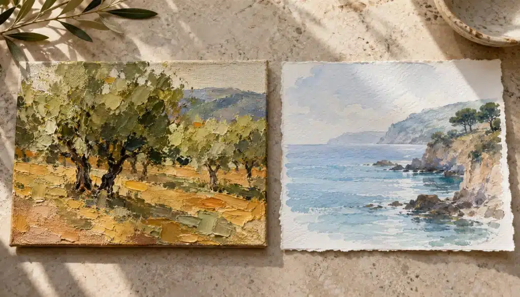
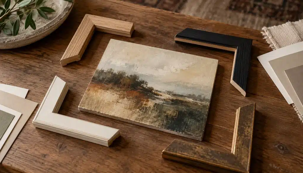
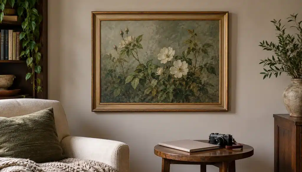
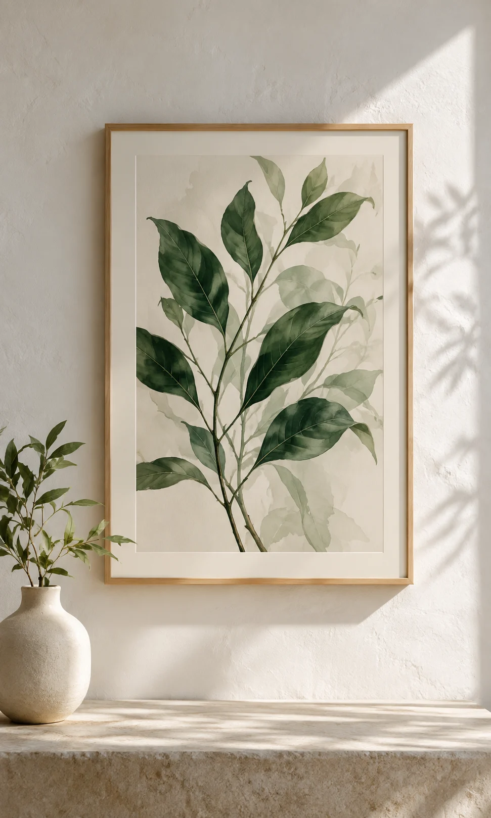
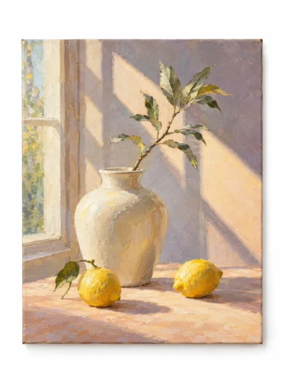
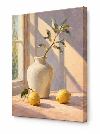
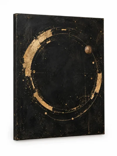
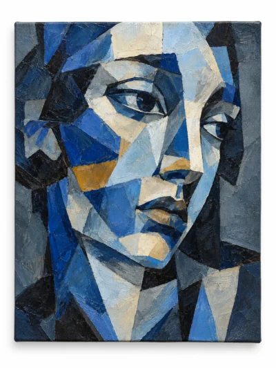
Artsy’s preview catalogue explores several visual approaches to coastal subjects, including restrained, darker, and abstract compositions. These images are for discovering preferences, not for confirming the appearance or availability of a real painting. Save the directions you enjoy and use concrete colour and composition notes to begin an enquiry.

 English
  Spanish
  Italian
  French
  German
  Chinese
  Arabic
  Dutch
Dutch  Norwegian
  Polish
  Finnish
  Portuguese